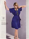
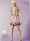
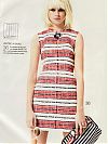
This issue of Patrones appeared in my postbox completely by surprise, as apparently my future-mother-in-law has been persuading all her holidaying friends to buy them for me while they’re in Spain! How lovely!
I didn’t bother to scan any images from the “Nuevo Hippy” feature, because, as it turns out, Nuevo Hippy is exactly like Viejo Hippy – fugly tiered dresses and kaftans we’ve seen a thousand times before. Gross. If there’s one style I hate, hate, hate above all others, it’s hippy.
Thank god, then, for the bikini feature, which is at least something different for pattern magazines!! There’s about ten styles in all, some with structured bra cups, others with soft, and about four different bottom shapes and styles that you could easily mix and match according to what you prefer.
The other features appeared to be all over the shop – a few nice dresses, some good jackets, a pair of shorts or three, some weird suspender/braces trousers, but nothing that seemed really coherent like what’s been in months past. Not bad, mind, just nothing spectacular.
And rounding out the Plus section, they’ve actually got a flattering one-piece swimsuit pattern that actually looks like it has some support in the bust, though it doesn’t fit the model terribly well…
I must admit, the summer issues of pattern magazines are never usually my favourites, but this one just gives me the uneasy feeling that the Patrones of months past may be well and truly dead.
So why do I think they’ve jumped the shark?
Well, #1 is that they’ve stopped attributing designer patterns and just name the patterns “Blue blouse” or “Black dress”. Yawn. Seriously, did they not realise that half the thrill of their magazine was the aspirational sewing aspect? I mean, I could never afford to buy that £3000 Prada gown, but I’ve got the pattern for it so I could theoretically sew it myself! And drooling over designer patterns is something Patrones seemed designed for! It’s much more difficult to get excited about “Navy jacket” than “Yves Saint Laurent jacket”!! That, and it may just be me, but the designs look a bit less off-the-wall (read: interesting) in this issue, but that may just be the Summer Effect again.
#2 is that they’ve moved the technical drawings and instructions to a horrible fold-out section stapled to the centre of the magazine like the pattern pieces. So instead of being able to flip through the designs at your leisure, you’ve now got to unpick the staples, pull out the pattern and instruction supplements, not lose the patterns, then unfold all the instruction sheets, rotate them around and follow the arrows to see if the pattern is constructed the way you expected from the line drawing. In other words, it’s a huge hassle that results in a big sheet the size of an opened newspaper that’s not really conducive to idle browsing and daydreaming anymore. I will say, however, that they finally added small technical drawings to the fashion photos so you can finally see the details of a garment without flipping to the instructions, but it still feels like one step forward and two steps back to me.
Let’s hope these changes are just a passing phase and they’ll get back on track soon, or I’ll be less and less likely to beg, borrow, or eBay Patrones issues in the future. And that’d be quite sad.


