Well, it was bound to happen… We’ve had quite a few great Burda issues in a row, but to my eyes, this one’s a stinker. I mean, there are a few patterns that are okay, but an awful lot of ugly that I couldn’t bring myself to even scan. I’ve sifted out what I could from this issue though, so here are my picks…
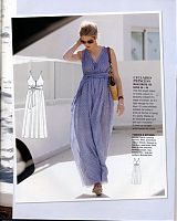
I’ve never been a big fan of maxidresses, but this one looks nice, if a bit “only to be worn on holiday”-y. There exist maybe two days in the year you could actually wear something like this in London and not look unspeakably sad. Which is why I don’t sew many summer clothes…
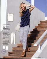
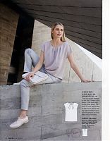
Here are two versions of the same simple, boxy top with pleats around the neck (not that you’d know it from the pose on the left!). I like this top (and to a lesser extent, the belt-required dress version), but I swear I’ve seen this design over and over again before. I do kinda like the idea of having an all-lace back, but I’d do it in a teeshirt pattern or something.
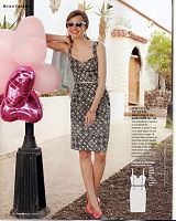
This bustier-style dress is quite cute, and I like that they didn’t publish it in Petite sizes for once (something about it just feels like their petite designs!), but again, there’s that feeling that we’ve seen this design a thousand times before…
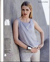
Ok, this top with the bubble hem and asymmetric drape I actually like, and I think it could be a really forgiving style for a lot of women, especially if you choose a really flowing fabric for that drape, which would also make the high cowl neckline softer. Added bonus that this pattern has the colour, illustrated instructions in the middle of the magazine!
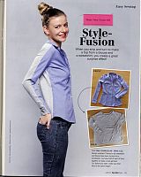
Sigh… Burda, I bit my tongue through all the boxy, dated, hoochie-mama, and just plain ugly designs in this issue (a necklace made from plastic rhinestones and snaps?), but I cannot sit back and have you tell us to chop a sweatshirt and buttondown shirt in half and jam them together. This isn’t fashion, this is dressing like a freaking DIY hobo.
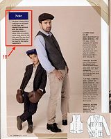
The Plus section is all really ugly, unflattering designs this month, so I’ll skip over that and get right to the children’s patterns, which this month is just for boys, and for men, in some weird 1920s-meets-Mumford & Sons styled shoot.
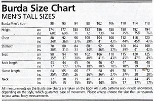
Wait — what was that you slipped in there, Burda, because that might be important – These men’s patterns are for Tall Men, which, AFAIK they’ve never, ever done before. Luckily, they printed a size chart for Tall Men in the magazine, which I’m going to post here:
Why am I posting it here? Because BurdaStyle.com have already started posting the men’s patterns from this issue, but without any hint of a size chart on the site for this new Tall Men’s sizing! So, once more for those who got here via a Google search, here is a “Burda size chart for Men’s Tall sizes”. You’re welcome, future readers, you’re welcome.

