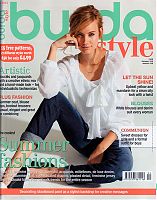
I’m a bit behind on my review due to my emergency trip to the States, but this wasn’t the greatest issue ever anyway, IMHO, but there’s plenty enough to like (and to moan about!).
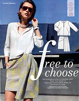
This shirt is probably my favourite of the entire issue – I love its angular seams, inset corners at the shoulder, and general shape. I thought it’d be the perfect partner for some muted, geometric Liberty lawn in my stash, but the pattern actually calls for jersey. For once I actually don’t want to sew something in jersey, figures! I also quite like the asymmetric skirt it’s paired with. It’s just a basic pencil skirt with some additional, diagonal darts and a drape but I think it works here.
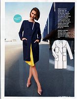
This coat pattern is shown in several guises throughout the magazine, but I like this classic navy version the best (minus the weird patch pockets over the boobs!). It’s also the pattern with coloured, illustrated instructions this month, too.
Here’s that same angular-seamed shirt as seen above, but made in a thicker fabric so it looks more like a sweatshirt than a teeshirt. The skirt it’s paired with here is very simple, but works well to showcase a special fabric, or in this case, just two great colours! (also, bonus points for including a bicycle in the photoshoot, Burda!)
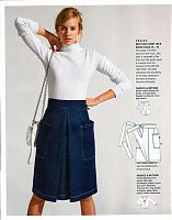
Somehow in a feature all about pairing denim with white shirts, Burda have failed to provide a classic jeans pattern (ummm, okay?). But on the upside, this wrap skirt pattern is really cool – it reminds me a bit of Tilly’s Miette skirt pattern, but Burda’s incorporates a deep centre front pleat and wraps round to tie at the back instead of the front.
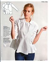
On first glance, you might look at the shape and flip the page, thinking “ugh, not another peplum shirt, I’m so over those!”. Or at least that’s what I did the first time through. But there are some amazing details lurking in here, like the curved neck placket, two-part sleeve, and that amazing asymmetric, freehand curved joining seam! The latter totally looks like something out of Pattern Magic, and certainly elevates this above your average white dress shirt.
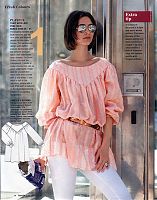
Behold – the ugliest top I’ve seen in a long, long time. Off the shoulder, unflattering gathers, zero body shaping, boring yoke, and to top it all off, a weird, furry fabric. That’s also so sheer you’d have to wear something underneath. Impractical and ugly? That’s impressive.
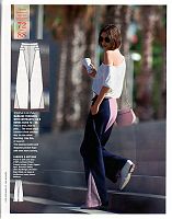
What? You’d like something equally ugly to wear with your ugly, shapeless, furry top? How about some horrible clown trousers! Hooray!
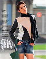
You may not notice it immediately, but this leather jacket uses the same base pattern as the navy coat seen above but adds some colourblocking and an attached jersey scarf collar. I’m not keen on the particular leathers they’ve used here, but it’s a nice enough concept.
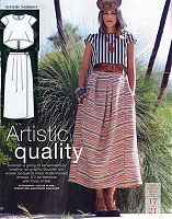
I’m not likely to ever wear a crop top, but I thought it was interesting that this is yet another variant of the first shirt I liked with the angled seams, showing you can also make it with short sleeves if you like. The skirt is also a variant of the yellow cycling skirt, so I almost didn’t show this again, except that I bought some striped, woven fabric in Mexico as a souvenir and I wanted to remind myself that this would be a good pattern to actually use it!
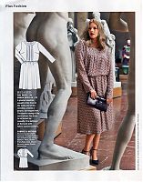
And finally, in the Plus section, which had some decent separates, my eye was drawn to this frumpy mistake. This design might seem fine on paper, but put it on anyone with half a bust and it’s just the frumpiest, least-flattering design possible. Ugh. Poor model.

