After August’s total stinker of an issue, I was really hoping that September would be a great one to pull me into Fall sewing and inspire me, but this one is just as bad! Seriously, I kept pulling this one out every few days thinking “it can’t be that bad – there must be something worth making in it…”
Well, after struggling to find the good in it, I’ve found some acceptable details that might be worth repurposing, but IMHO this is a new low. Sigh.

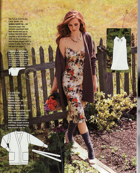
We wait ages for Burda to produce some decent lingerie patterns, and then they go and disguise this slip as a neo-grunge dress! I’m not entirely convinced by the front pleating, and since they’ve obscured it in every photo (here in a very busy print), I’ll have to wait for those keen Russians to sew up a few before I make my verdict…
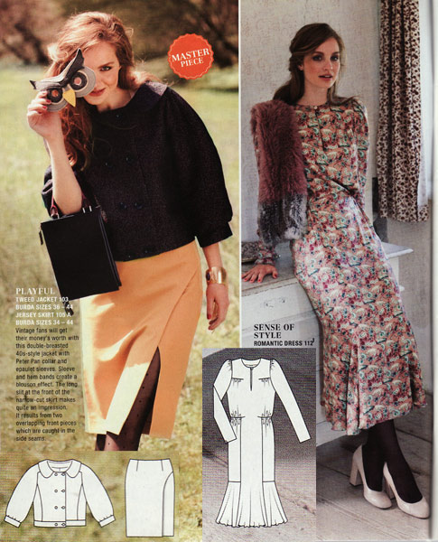
The cropped, Peter Pan-collar jacket – ugh. The bad dress hangover from last month’s disgusting neo Victorians feature – double ugh. But the jersey split skirt – yeah, I’m alright with that. This is probably my favourite of this issue, and it’s quite telling that I’m even just lukewarm on it.
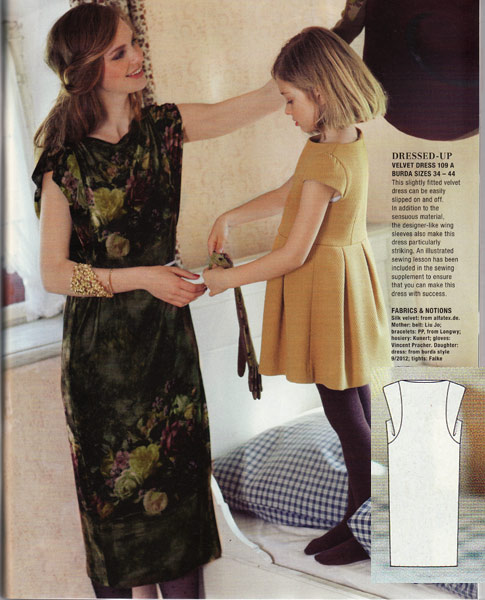
The winged sleeves are a really interesting detail here, and it’s a bonus that this has the illustrated instructions for this issue, but why did they have to put them on such a shapeless sack of a dress??
I initially dismissed this jersey tie-back dress (and its partner top) because, well, I’ve seen this design a freaking million times before. But as I’m having to adjust pretty much my entire wardrobe as I’m losing weight through running, I can totally see the appeal of having some clothes which just adjust in the ties…
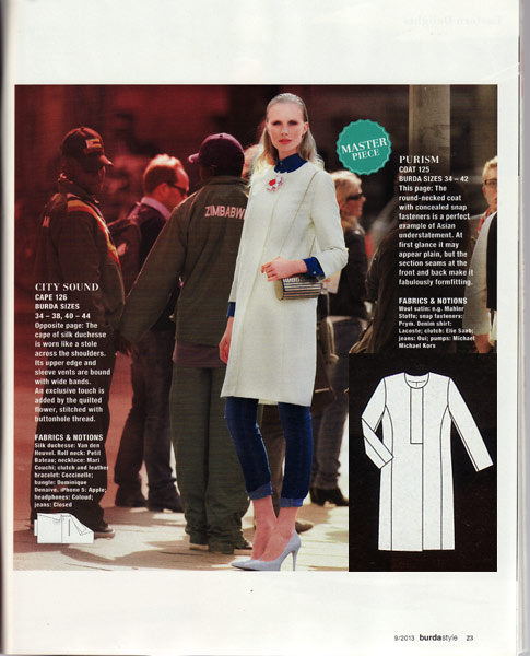
This uber-sleek coat must be a designer knockoff, because it is way too stylish for Burda right now (and the one-off model is usually a sign, too). Anyone know the runway inspiration?
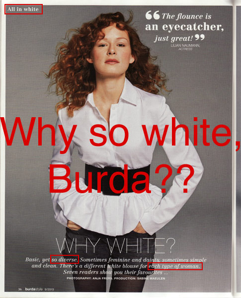
Ok, settle in for a rant here (or feel free to skip down to the next photo)… I have totally called out Burda in the past for being the most white-washed magazine I have ever seen. They only recently had their first black model (a reader, in ONE photo) in memory, and otherwise it’s the usual “German diversity” of having a brunette and a blonde.
But now they seem to be almost, I don’t know, flaunting the fact that they’re so freaking white? In this issue they have a feature on different styles of white shirts, all modeled by readers, which is fine. But check out the copywriting on this… “All in white”… “so diverse”… “each type of woman”… yes, so long as they’re all white women. Seriously Burda?!? How can they still get away with this? This is a magazine with a massive global readership, it just blows my mind.
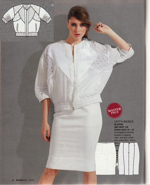
The designer patterns this month are from John Richmond (I’m showing my ignorance here, but I’ve never heard of him before this). The jacket is horrible even if you squint really hard at the tech drawing and try to imagine it in better fabrics, but the pencil skirt has some rather nice, shapely seaming in the back.
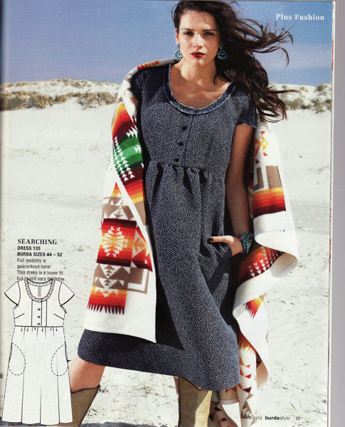
Oh dear. If you’re going to make an empire line dress, it needs to be in a soft and flowing fabric to avoid the dreaded “Is she or isn’t she?” pregnancy questions. That they’ve made this for Plus sized women just seems cruel.
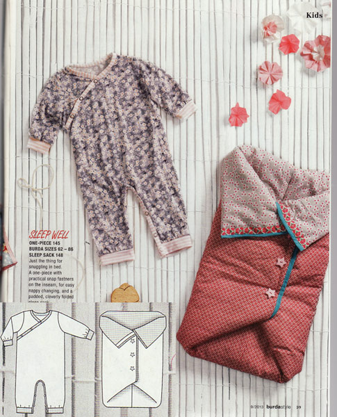
If you’re anything like me, you find yourself sewing for friends’ new babies fairly regularly, so this onesie and baby leggings look like they’ll be really useful!
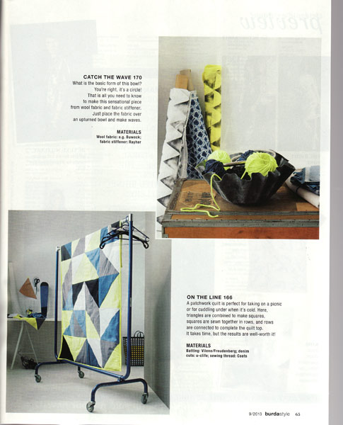
And finally, it goes to show that I was so desperate to like something, anything in this turd of an issue that I found myself drawn to the home dec section (I know!). But I really like the colour combo of denim, black, white, and lime green, like used here in this remedial quilt.
What about you, dear readers? Are you as bored with the last few months of Burda magazine as I am? Or did you find this month as surprisingly pleasant as paunnet did?