One cost that can add up really quickly for a wedding are all the printed materials you need for the day. I’m not just talking about the invites (which can get ridiculously expensive if you go the letterpress, inner envelope, return card, RSVP envelope, etc route!), but also all the other bits of papery stuff that is forgotten until a few days before when you realise you actually do need them!
The illustration
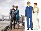
The first step in our wedding design process was to commission a cartoon drawing of us from the illustrator John Allison (of Scary Go Round fame). James has been a big fan of his comic for ages now, and we both really liked his design style. So we sent him a photo of us, a brief description of James’s suit and my dress (at that point I was still thinking of that Vogue cowl-neck number) and to imagine 6 months’ more hair on my head. Which somehow he got eerily spot-on.
(Apologies for the awful jpg artifacting – I’ve not got the big version of the illustration in front of me to work from)
The wedding website
With the illustration in a nice, big file, we could then set about making our wedding website, which was to be the crux of our invitations. We both work in web developments, and absolutely everyone we know, right up to my grandparents, has an email address, so this way we could put the bulk of the information for both receptions on our site and be able to update it later, too. The RSVPs were all online, using a Google Spreadsheets form (easy to set up, easier for people to reply to than a trip to the post office, and we could both get access to the running tally), and all the usual venue info and registry links could be added without having to worry about word counts and layout.
I can now post a link to it for you to have a look at James’s standards-compliant coding prowess, because I don’t have to worry about you all messing up the RSVPs or gatecrashing or anything! The worst that can happen is that you decide to buy us some more insulation off our registry…
Invites
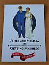
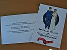
So with the website in place, all the invites really had to do was give folks the date, and point them towards the website. We ran up two sets of postcards from Moo.com (one set for the UK wedding and reception, and one for the Pennsylvania reception). And to set the tone, the wording was “James and Melissa are finally getting married!” ha!
We actually used Moo.com alot. They have a limited range of products, but they’re cheap, fast, and you have a lot of control over the design. Whereas I was all about the sewing and crafts for this wedding, the graphic design was James’s domain.
He also had the great idea to order up a set of stickers with a tiny cartoon us and the UK wedding date for people to peel off the invite and stick to their calendar. These were so popular that we know of at least one fight that broke out when she took the sticker and we had to quickly deliver another one for him to put on his calendar!
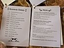
Order of service / menu / thanks / notes cards
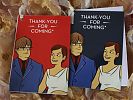
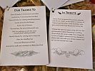
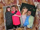
Inspired by these, we ordered another two sets of postcard from Moo.com – for the front, a zoomed-in cartoon of our head and shoulders with “Thank you for coming*”, and for the back of the stack, 60 different photos of us throughout our 7 years together. Some dressed up, some slobby, some cold and windswept, some drunk, one in a Tardis (amongst our friend, this was the “prize” one to have!), many on holiday, and quite a few in our “fat years”! So with the postcards as the front and back covers, we then printed the order of service for the day, menu, list of thanks, and some notes on the dress and flowers on the separate sheets inside.
The inside sheets were just printed on our home laser printer on slightly heavier paper, and then we recruited our new mum neighbour Lucie to punch holes and tie ribbons to help us out (feeding baby in on one hand, hole punch in the other! What a pro!).
Placecards
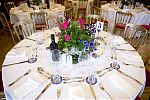
Another small but necessary detail is that people need to know where to sit. We solved this by printing up our own placecards on our home laser printer and thicker paper, so that they’d fold in half and stand up at each person’s place.
But just having a name is a bit boring, so we decided to liven things up by placing quotes from “Don’ts for Husbands” and “Don’t for Wives”, both from 1913, on the reverse. And James had the task of somewhat matching the quotes to the people! At the UK wedding, these went down a storm, which people laughing and sharing theirs around and asking us about them, but for some reason, they didn’t really even get noticed at the PA reception. I’m not sure if it was the silver cardstock reducing readability or if the Americans were just too busy talking and catching up to flip them over….
Cupcake and cheeseboard menus
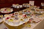
With our extensive cupcake selection (more on that in a bit!), people also needed to be informed of the flavours so they could quietly drool into their lap and plot and plan which they’d attack when the time came.
And likewise for our evening cheeseboard – I don’t know about you, but I couldn’t tell a Cashel blue from a Stilton by looks alone, nor a Mull of Kintyre cheddar from a Cheddar cheddar. So a cheeseboard menu was also self-printed, with the edges trimmed, then glued onto red cardstock to make it more substantial. Not like the cheese lasted that long, mind!
Signs
And just when you think you’re finished, you realise there are signs needed to direct people around and to simply just inform. Like the sign on the bar saying beer, wine and drinks are free, but spirits you’ll have to shell out for yourself. Or the sign on the lavender confetti box asking people to take one, and explaining what they’re for:
These were all self-printed also, keeping with the general wedding font James had chosen!
(Thankfully our venue took care of printing the table layout onto a poster-sized board!)
Beer mats
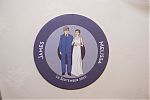
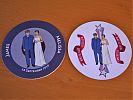
One special, personal touch we decided early on that we just had to have was custom beer mats. My Dad has my friends gathering beermats (coasters) for him from all over the world, and when he walks into The Pub, in Duncannon, PA, he takes his exotic beer mats along and plops one on the bar with each order. So we just knew we had to surprise him with some special wedding ones!
These we had custom printed, but they’re exactly like the commercial ones you have in pubs, and printed on both sides, and it was a nice thing for people to take away as a favour, without being super-sweet, or totally useless, or just some tacky dust collector. And they were lightweight enough to fly back for the Pennsylvania reception, too.
…and the thank you cards, too.
But we’re not quite ready for those yet. Moo.com will be printing them up in a little bit.
*or is it just the way you’re standing?

