My copy of the latest Patrones Magazine (#264) arrived last night! As I explained last week, it’s incredibly difficult (and expensive) to get your hands on, but this issue has fulfilled all my expectations and more. It’s kinda sad, but I actually had trouble sleeping last night because my mind kept wandering over all the details of about ten of the designs while I was trying to sleep!
The Jean Paul Gaultier skirt (#69) is absolutely first on my list. It’s hard to see from the photo, but there are curved seams running through the front and back that are begging for contrast fabric – I’m thinking black wool crepe with black satin or leather curves (I also really like the blouse in that set, too). This St Emile dress (#52) I want to hack and just make the top portion as a blouse. Whereas this Hoss blouse (#66) is just beautiful on its own when it’s not opened up all the way – the dropped shoulders in particular are incredible! This Escada dress (#67) has infinite possibilities and looks so comfortable to wear, even with the multiple layers. And it must be a sign that I’m really into frilled accents right now, but I love this Guess shirt (#44), but it’s not got quite as many as BurdaStyle’s JJ blouse, so I might just make that instead. 😉 I’m normally a huge fan of Prada, but the Prada dress included here (#64) left me a bit cold (and presumably, the model, too! Wow that’s low cut!).
It’s funny, but there were only a few I was interested in when I looked at the photos, but seeing them against the line drawings made me SO much more excited for a bunch of them…
In any case, I’ve had a lot of helpful comments and questions surrounding the last Patrones article I wrote, so I thought I’d further the scientific (“sewentific”?) knowledge by conducting a comparison of three sewing pattern magazines I know and love, so others can decide for themselves if it’s worth spending the time and effort to hunt down Patrones.
It was difficult finding “virgin” copies of the other magazines that I hadn’t sewn from yet, but I managed to find the October 2007 issue of Burda World Of Fashion magazine and the January 2008 issue of KnipMode magazine in completely unspoilt condition with the inner pattern section still unfolded and stapled in place to get an accurate comparison against this January 2008 (#264) issue of Patrones magazine.
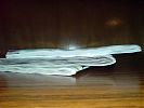
First up is a thickness comparison: Patrones on top, then Burda WOF, then KnipMode on the bottom
As you can see, Patrones is way, way thicker than either of the others. To me it feels like an average issue of Vogue magazine, with 100% glossy pages. While Burda WOF and KnipMode have glossy pages at the beginning and end of magazine with newsprint pages in the middle and the pattern sheets stapled in the centrefold, Patrones is entirely glossy, with just the newsprint pattern sheets stapled in the centrefold. There are also just more pages – there are 93 patterns in this one, and each page has 1-3 designs on each one, and no real articles or interviews. It’s pretty much all fashion, with only a handful of advertisements.
Next up, the pattern sheets: First Patrones, then Burda WOF, then KnipMode
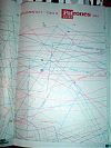
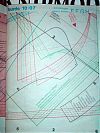
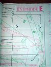
Burda WOF and KnipMode are pretty much the same when it comes to the pattern sheets (though KnipMode’s sheets are smaller, meaning you often have to join two pattern pieces to make a long trouser leg or dress panel). While Patrones only offers three sizes, they cram a whole lot more onto each pattern sheet, making the tracing process even more “interesting” than usual! All three pattern sheets are printed on similar weight newsprint with coloured tracing lines and markings.
Finally, the instructions: First Patrones, then Burda WOF, then KnipMode
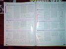
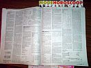
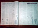
I’m afraid I can’t give a comparison of the actual wording and helpfulness of the instructions themselves as I only speak English (and schoolgirl French), but I can compare the “real estate” devoted to each pattern’s instructions. KnipMode tend to give the most space to each pattern, going over several columns with each major step having its own header to split it up (making it nice and easy to just translate the headers and ignore the rest). Burda WOF’s instructions are known for being very terse, but when compared to Patrones’s, they might as well be War and Peace! Patrones really only seems to give the bare minimum information – front and back line drawing, fabric type and amount requirements, basic layout diagram, and very short instructions consisting of sentences of only a few words long. It’s probably good that I don’t speak Spanish, as I don’t think I’d be gaining much from reading them anyway!
The photos of the clothes themselves are all quite similar in layout (though not in photographic style!), with two major exceptions: Patrones does not repeat any design in the magazine, whereas Burda WOF and KnipMode will style the same design in two or three different ways in the same issue. And I really like that in KnipMode, the line drawing is printed right alongside the photo so you don’t have to keep a thumb in the instructions portion of the magazine and keep flipping back and forth to compare photo vs line drawing like you do with Burda WOF and Patrones.
Anyway, this has all been a learning experience for me, and I’m sure the first Patrones pattern I trace and sew up will be, too! I’ve also had wonderful news from a mysterious benefactor who lives in my area who’s loaning me a few of her Patrones back issues to trace and photocopy, so I’ll soon have a lot more designs to choose from (even 93 patterns is never enough! bwahahah). So don’t be surprised if my progress on the tuxedo trousers slows over the next week or so, as I’ll likely be tracing like a woman posessed!
Edit: It’s come to my attention that a lot of you viewing my site through RSS are using the wrong feed and seeing everything BUT my finished garments (which are clearly the prettiest part!!). If you did not see my boyfriend’s fleece or my finished blue Pendleton wool jacket, please change your RSS feed reader to use this link right here and you’ll then see everything!!

