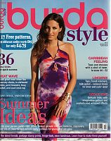
The summer issues are never Burda’s forté but wow this issue is particularly bad! For me, the only reason to not throw this in the bin full stop is the lingerie section. Paunnet has already savaged the ridiculously, hideously ugly stuff in this, so I’ve tried to keep my complaining to a minimum. It was dragging me down to complain so much, but I just couldn’t help it on a few!
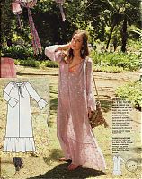
Like this first one – this is quite possibly the most hideous pattern Burda has ever published! I couldn’t believe the editor actually chose this one to restyle later in the magazine, proving once and for all that you “can’t polish a turd”!
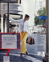
“These trousers conceal LEGS”. Ummm, and?!? (I personally think the top and trousers aren’t too great with less-than-ideal proportions, especially for Tall women, but this bit of copy just made me crazy!) Did their usual barely-speak-English translators go away on holiday already or something? (Also: “batik” is not the same as “tie dye”!! arggh)
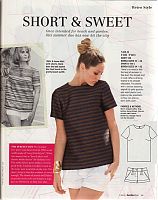
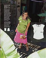
The vintage pattern this month is a woven tee and shorts from the 1960s. Both look really modern and wearable, though making the top in “rafia” sounds like it’d be really uncomfortable! I’ll take mine in silk, thanks very much.
Skipping over a HUGE amount of ugly, rectangles, and ugly rectangles, we now get to the only decent set of patterns in the entire magazine – the lingerie feature!
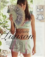
First up is a soft (ie: no underwires) bralette and little shorts, both with contrast banding and some really nice added features. I think either could be really comfortable as either underwear or pyjamas, and neither are designs I’ve seen elsewhere before. Bravo!
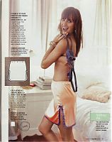
Burda call this a “lingerie skirt”, and for anyone under the age of 30, this is what my mom called “a skirt slip”, and you’d wear these underneath skirts that didn’t have linings to prevent it riding up. I’ve not seen a pattern for one in years (though really, you could use about any skirt pattern!), so it’s nice to see a dedicated one with with similar contrast binding to the shorts.
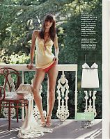
There’s also a pattern for a camisole (in varying lengths), which again you could either wear as underwear, or pyjamas.
In the Plus section, they’ve provided a pattern that’s also in the regular section of the same issue, for the first time I can recall. On the downside, the asymmetric gathers under the left boob are REALLY unflattering. I am a massive fan of asymmetric designs, but please, Burda don’t make my boobs look lopsided, that’s just wrong!
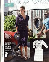
But to end on a high note, the last Plus pattern is a really versatile and flattering jersey dress with gathered side seams, cowl neck, and long sleeves (which you could easily shorten if you wanted).
Thank god the August issue always starts off the Fall fashions and the end to the awful, awful “silly season” summer patterns! I read someone say recently that they only ever buy a 6 month subscription to Burda, starting in August ever year, since the summer issue suck so much, and it totally makes sense…

