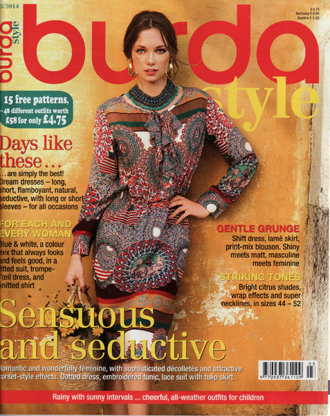
There wasn’t much to get excited about in this issue, in my opinion. March is always the issue with the bridal gowns, but even those left me cold for the most part – overly fussy with too many extra frills, bows, and (in non-bridal sections), migraine-inducing ugly prints.
I’ve pulled a few nuggets from the pile though…
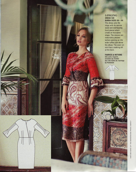
This dress was the only design from the first feature that I even glanced twice at – I really like all the pleating, but that surplice opening looks like a wardrobe malfunction waiting to happen, and the model’s pose doesn’t help. It looks like she’s stiffly holding herself to avoid anything creasing or opening up!
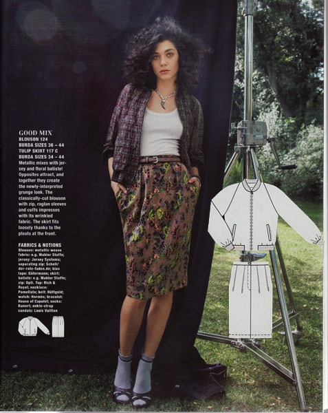
Burda’s take on “grunge” was almost as laughable as their taken on “punk” earlier this year, but I did spot this very on-trend bomber jacket, which looks rather nice.
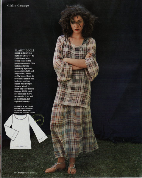
This is one of the ugliest outfits I have ever seen in Burda. Ever. Hideous tartan chiffon (why??!) paired with itself, plus the laziest drafting I’ve seen in a long time – those bell sleeves look like what a My First Pattern Drafting student might do if it were 1993. Ugly ugly ugly. UGH.
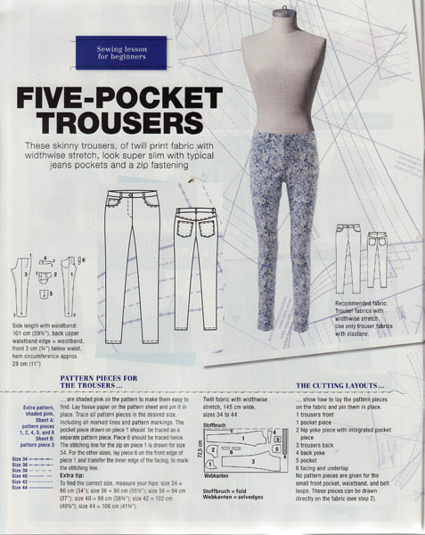
Burda print classic jeans patterns so infrequently that you’d think they’d be shouting about these from the front cover – “Sew your own jeans! Easy, step by step illustrated instructions!” Do they not want to sell issues or something? Why else would they disguise these in an ugly floral and call them “Five pocket Trousers”? It makes no sense! (If you missed the take-home message here – this issue is worth buying for these jeans alone.)
Someone on Burda’s drafting team has definitely been working their way through the Japanese drafting books, and IMHO it’s a wonderful thing! First we got a near-identical version of a Pattern Magic top, and now we get this basic tee with a single, added asymmetric pleat. Very chic, very wearable, and very Japanese.
There’s nothing particularly special about this princess-seamed top and skirt, paired together to look like a dress, but it could be a great alternative to a sheath dress and the seams would make for easy fitting.
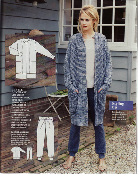
The long cardigan does nothing for me, but the jogging bottoms/sweatpants/joggers/trekkie bottoms caught my eye, somewhat wistfully though as I dreamt back to the Burda of the last decade where we’d get special exercise wear features full of really wearable workout clothes instead of just watered-down loungewear… sigh.
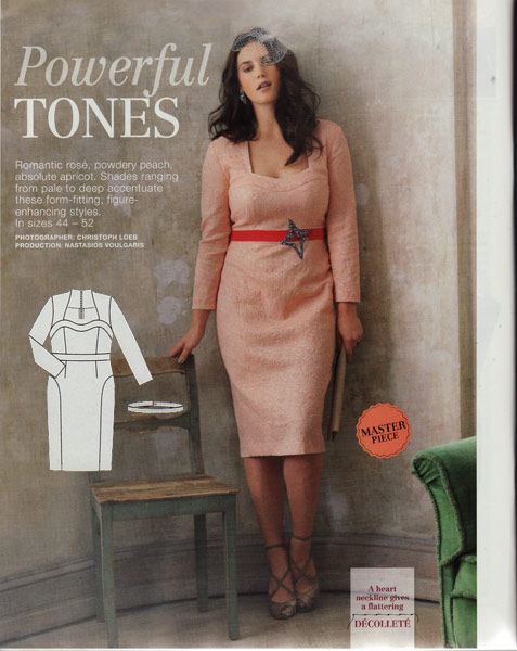
On to the Plus section and omg check out the amazing lines of this dress! It’s clearly one for pears rather than apple figures but my god is that a bombshell look!
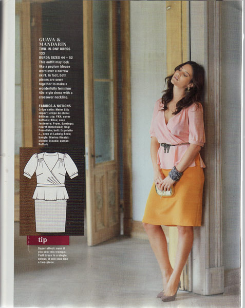
Burda really like their “dresses that look like separates” this month, because there’s another here for Plus-sized ladies. Though, really, you could separate the top and peplum and have a very nice top should you want it…
I don’t usually mention the kids patterns because I don’t often sew for kids so I fail to get excited about them but this month there were more designs I wanted to wear in the kids section than in the rest of the magazine! ARRGH. I mean, none are particularly difficult to draft in my own size, but I could do the same from a fashion magazine photo – I buy Burda to get the patterns I want to wear!
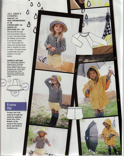
First off, this teeshirt with the asymmetric insert is SO cute with the stripe play, not to mention the shorts… There’s also a basic raglan tee, waterproof rain trousers, basic joggers, and a cycle seat cover, too.
And here, I’d totally wear that cap-sleeved hooded sweatshirt in a heartbeat if it were in my size! Not so much the playsuit/romper, though, but you can’t argue about its age-appropriateness for once!

They actually provide a women’s version of the only pattern in this section I don’t want to wear myself, the shapeless rain poncho. Figures!