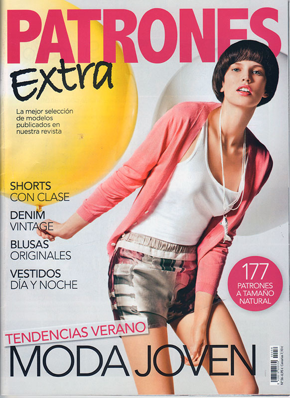
It’s been a while since I had a Patrones magazine to share, but I kept an eye out for them while we were in Malaga last month. Eventually I found one on a newsstand in the centre of Malaga, but they certainly weren’t as easy to find there was they were in Argentina, which is more than a little odd considering it’s a Spanish magazine. It comes sealed so the pattern sheets don’t get separated or lost (as they’re not stapled in place like Burda), but it also means you can’t peek at the styles before you buy.
Anyway, if you’ve been following along with my reviews over the years, you might recall that they used to do knockoff patterns of seriously high fashion designers, then there was a fallout and they stopped being able to name any non-Spanish designers (so no more Gucci, Prada, Paul Smith, etc), and around the same time they also started to produce compilation magazines made up of a bunch of old patterns and photos lumped together. The only way you could tell the difference between the latest styles and the “latest” compilation was to look at the issue number, as the “new new” were in the 4-500s and the “not really new” had very low issue numbers.
So to break down the cover of this particular magazine:
- “Extra” = more patterns than usual (they’ve also got other flavours of magazine like Spring/Fall style, party season, stuff like that)
- Issue 56 = These will be reprints so I may or may not already have some of these in my archive, and they might be a few years old. But on the upside, it’s usually a mishmash of sizes rather than the standard same 3 (which changes based on which flavour of Patrones it is. Confused yet??)
- “Moda Joven” = “Youth Fashion” = tells me the patterns should still be fairly trendy!
- “Tendencias Verano” = “Summer Trends” = wispy and floaty styles totally unsuitable for English summers…
But enough about the cover, let’s have a look at my picks!
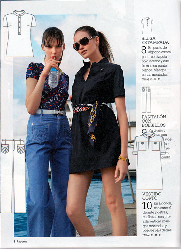
The first feature is all maritime-style and, while I’m not into the Kriss-Koss-esque placement of the pockets of these jeans, I am totally digging the pleated/folded design going on here! Who am I kidding – I mostly just scanned this to remind myself to do this on the back pockets of the next pair of jeans I make…
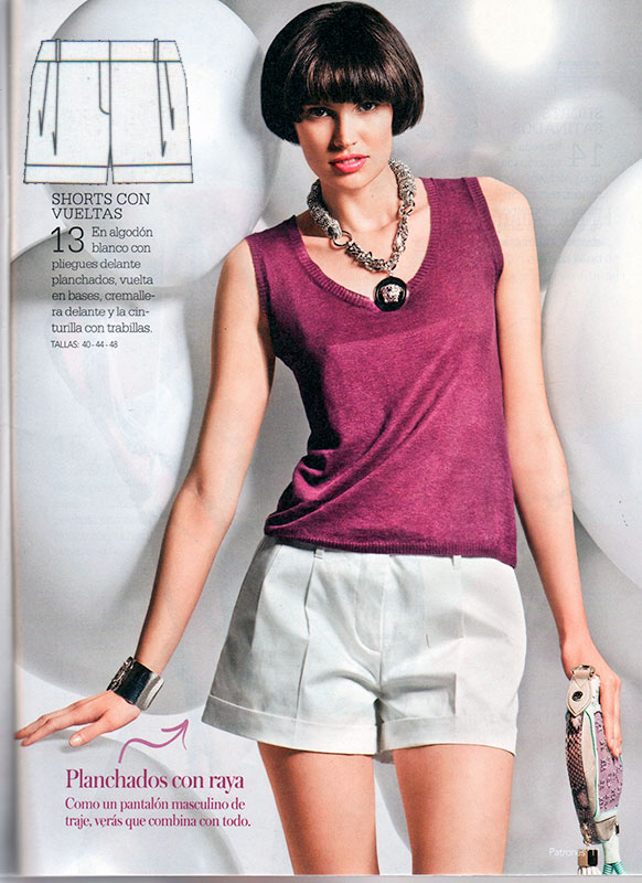
I have a love/hate thing with shorts, but these pleated ones look loose enough to be both flattering and comfortable (ie: don’t ride up as you walk, a common pitfall!). I also kinda like the summer knitwear worn with them, but there wasn’t a pattern included for the top.
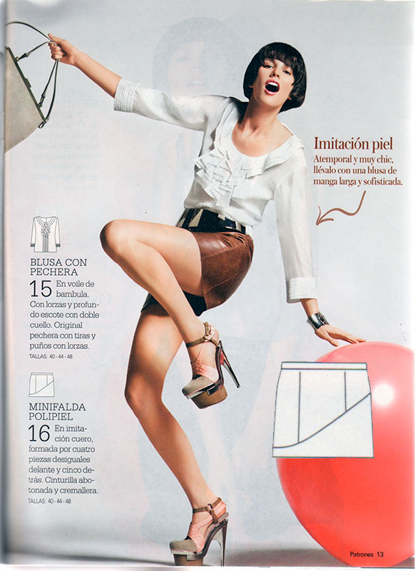
Patrones really do like their high fashion photoshoots (they buy these in, as I learned once when the exact same photos appeared in both Patrones and Manequim pattern magazines!), but seriously, could you at least pick one where I could see the freaking skirt?? I mean, I really like the seamlines on the tech drawing so at least they included that, but it’s kinda annoying to not have a photo to go off of as well.
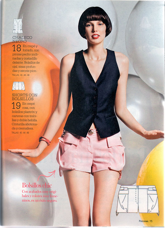
Waistcoats/vests are best left in the 1990s IMHO, but the shorts with their enormous pockets are really intriguing. I can see a bit of sport mesh peeking through inside the pocket, so does that mean the original seen here had mesh against the skin to cut down on the number of layers worn in a hot climate? The pattern interpretation included in the magazine makes no reference to the mesh, so I can only guess it was omitted for simplicity’s sake.
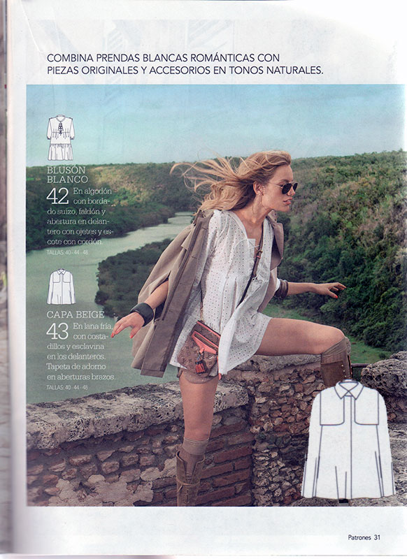
Patrones make the best coat patterns, but all we really get in this issue is a lightweight cape (worn with the most impractical boots I’ve ever seen). Note to self: must wear my cape more when it gets colder.
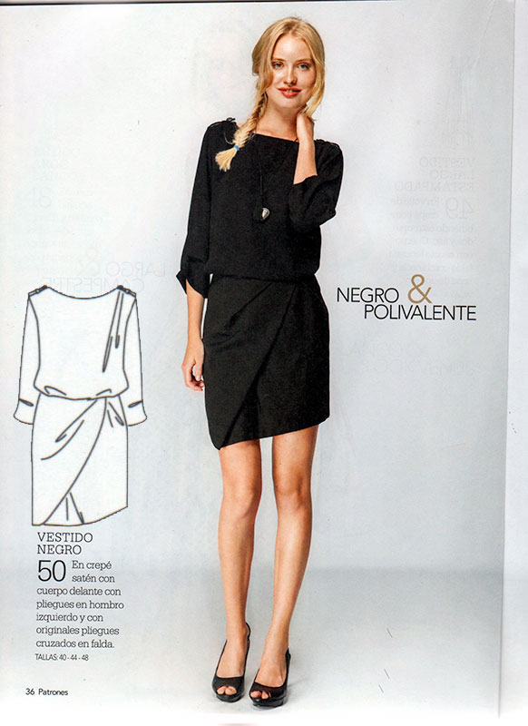
This is easily my favourite pattern of the entire magazine – it ticks all of my boxes! ✔️ Asymmetric ✔️ Draped ✔️ Chic ✔️ Wearable. It’s got buttons up the centre back that I’d probably replace with an invisible zipper, but apart from that, I’d wear it as is!
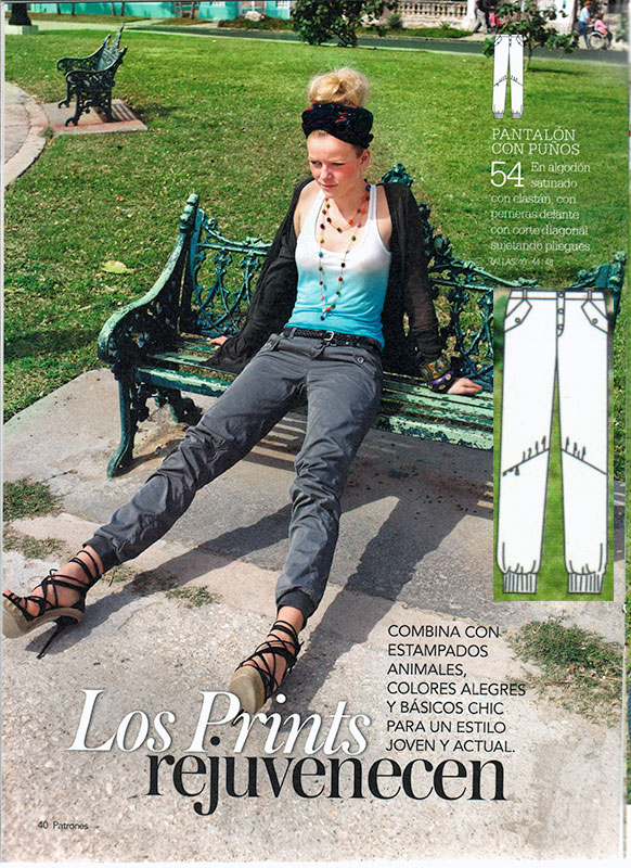
The photo is a bit… odd, and you can’t see many details on the trousers themselves, but the tech drawing shoes that they’ve got diagonal seams and pleats around the knees. Its an idea I’d like to stash away in the back of my brain as this creates space for bending your knees (say, for cycling) in a novel way. Though those cuffs have got to go, ugh.
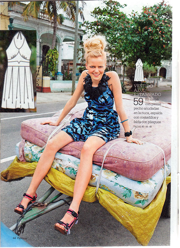
And finally I mostly just wanted to share this one because to me the model’s face is saying “Seriously? You really want me to sit on this stack of disgusting mattresses someone’s hauling away to the dump??” 😂
In other magazine news, I’ve been featured in the August edition of Sewing World magazine talking all about what it’s like to sew on a boat. Pick up a copy if you’re in the UK!
